WORK 01
Branding – Acorn Hill
Acorn Hill is a combination lodge, spa and bistro located in Lynchburg, Virginia whose mission is to provide the perfect cozy-casual lodging experience with a touch of southern charm. This project was a redesign of an existing company- the goal was to make the branding cohesice with the company’s mission and aesthetics to unite their varying services. The company previously had three simple menu designs with little unity or cohesion between them. The previous menu layouts were transferred from white paper and varying alignments to a tea-stained paper with rustic fonts and a victorian style to match the company background.
WORK 02
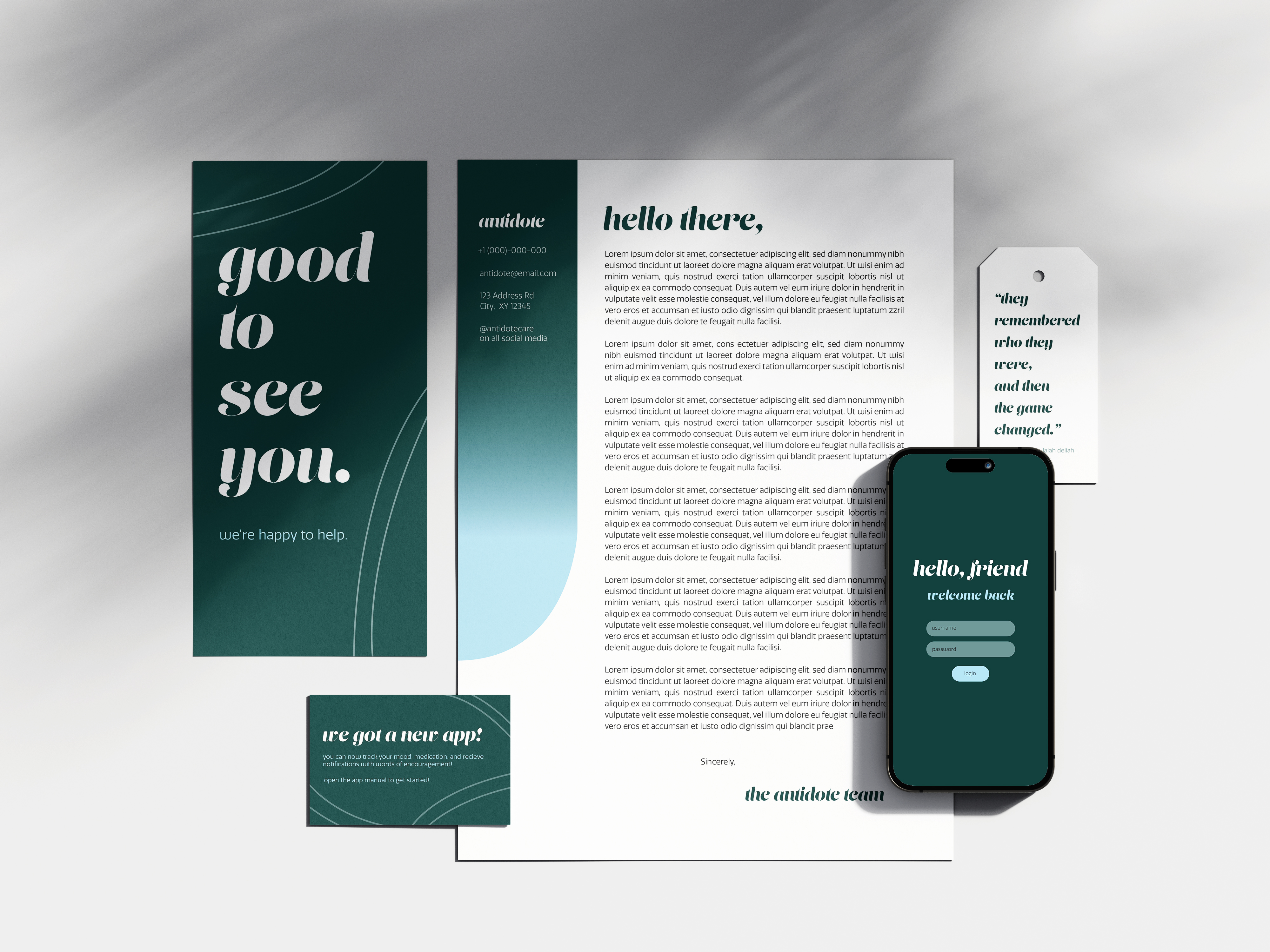
Branding – Antidote
Antidote is a fictirious mental health subscription service that provides comfort products, therapy prompt journals, and mental health/medication trackers. Each box contains a personal letter, information on the company application, therapy prompt journals and care packages. This was a project I create for practice; the idea occurred as I was searching mental health subscruption boxes and noticed a common theme that most services were majorly catered towards women only. The goal of this passion project was to create a gender-neutral subscription service that anyone can use. I compiled a color palette with cool, calming tones and combined it with an approachable and minimalistic look.


WORK 03
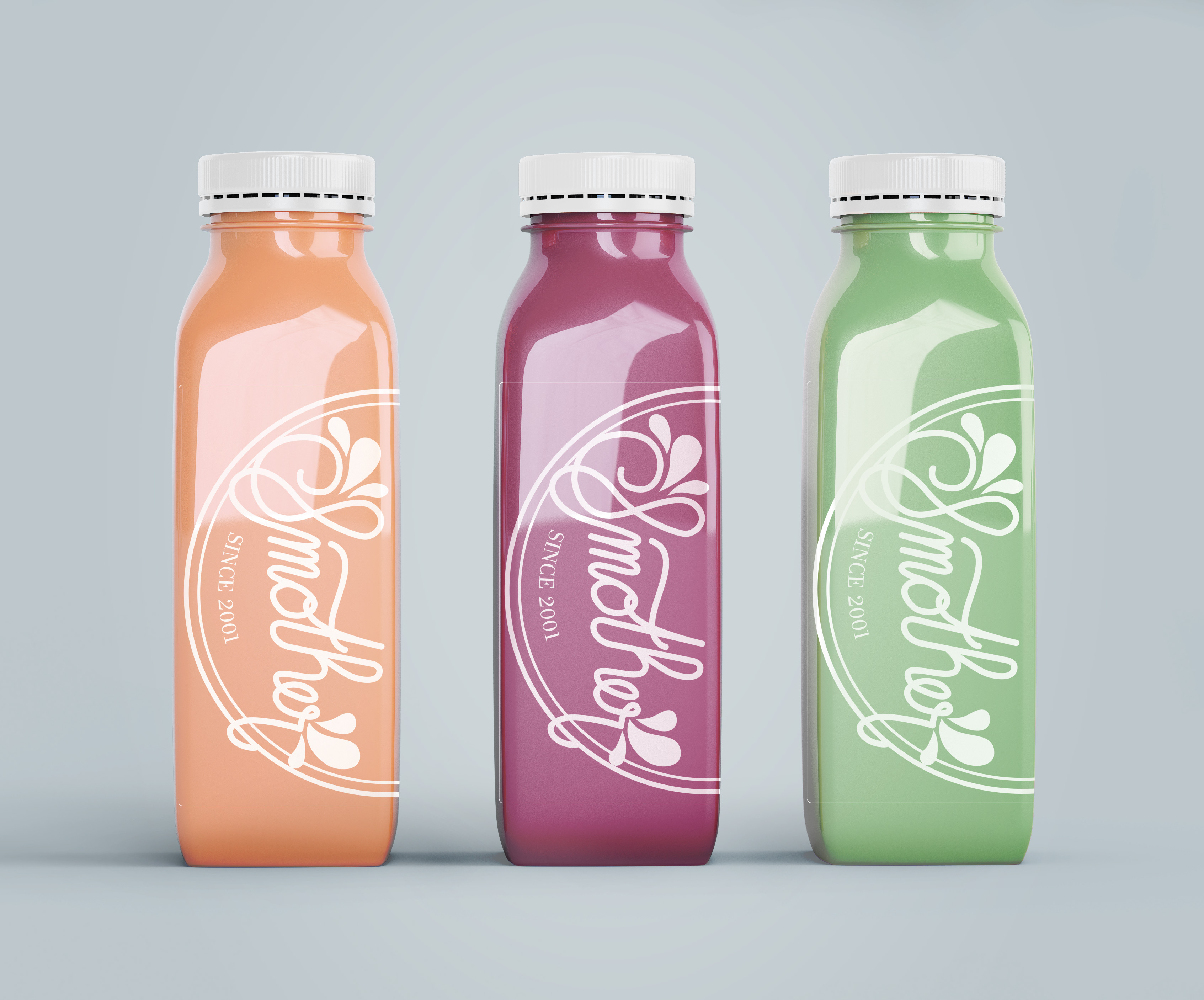
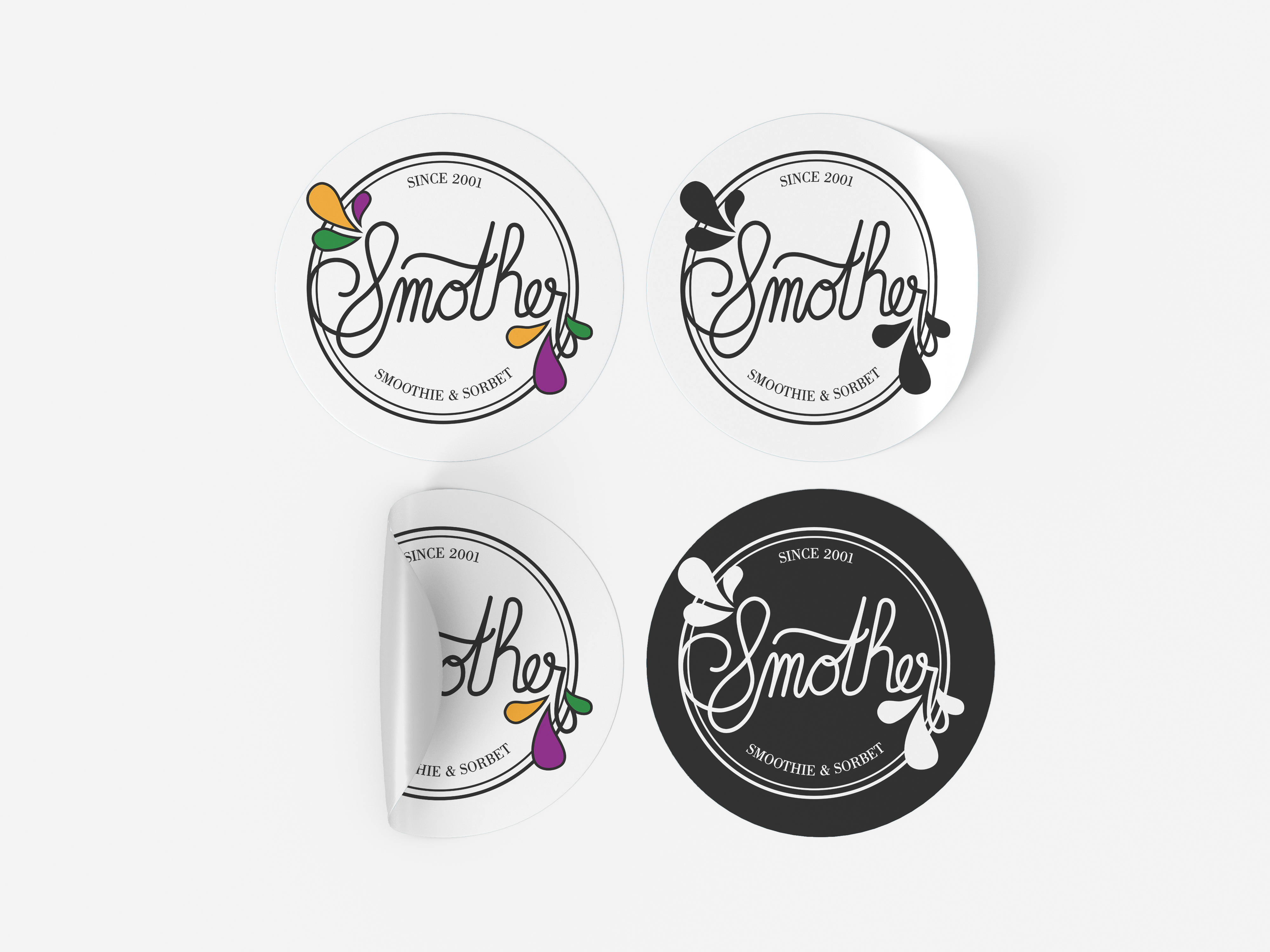
Branding – Smother
Smother is a fictitious food and wellness company dedicated to creating delicious and healthier food alternatives to normal sweets. The goal of this project was to create a fictitious brand and design company branding, product packaging and advertisements according to the audience demographics and company values. I developed primary and secondary logos with a fun and bright jewel tone palette combined with trendy linework and serif typography to target an adult/millenial audience.


WORK 04
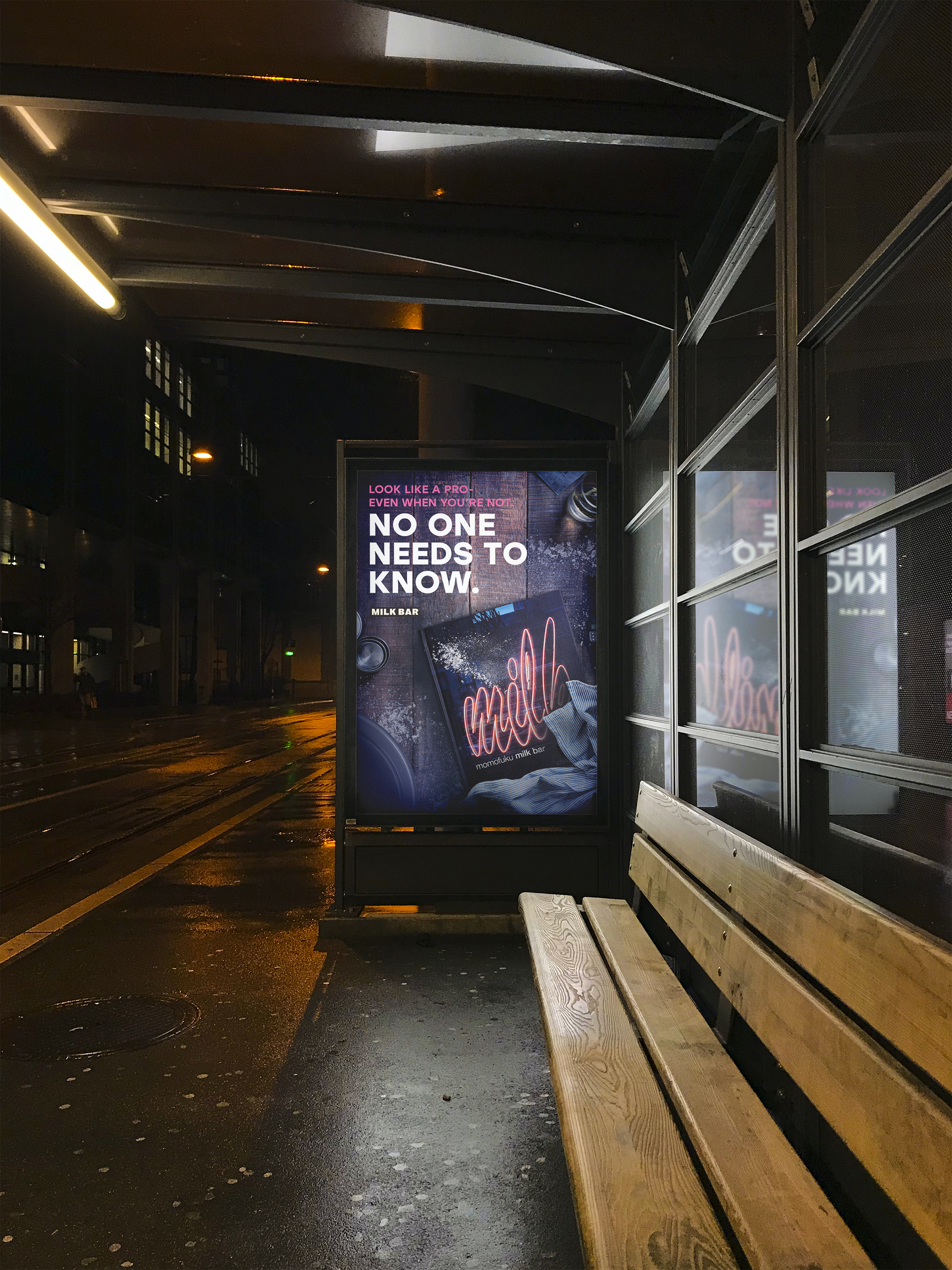
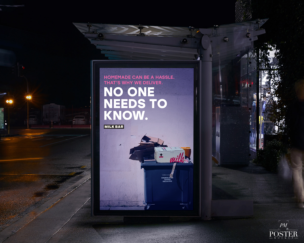
Conceptual Advertising – Milk Bar
Milk Bar is a bakery chain recognized online for nostalgic, sweet pastries and vibrant, fun and aesthetic branding. The goal of this project was to create conceptual advertisements for the Milk Bar company to convery a message rather than focusing on the product itself. The message being that baking for an occasion can be complicated and difficult- but with Milk Bar;s extensive options for baked goods and quick delivery, it does not have to be a hassle.
WORK 05
Advertising – No Lemon Lot Car Meet
No Lemon Lot is a fictitious car meet for any make or model held in Napa, California. The goal of this project was to create an informational poster or advertisement with typography as the main feature. Taking the target demographic into account, the minimalistic and urban design was the most appropriate to cater to a mixed age and Californian audience.

WORK 06
Experimental Typography – Legends Never Die
Legends Never Die is an experimental typography piece that pays homage to musical artists who died tragically during their fame. Featuring the font Bebas Neue, the piece was created to resemble a modern-style record or disk, featuring type linework of the musical artists’ names, with hidden phrases such as “everyone dies but not everyone lives” (also written in binary code on the right side of the image), “rest in peace” and the title itself, “legends never die.”

WORK 07
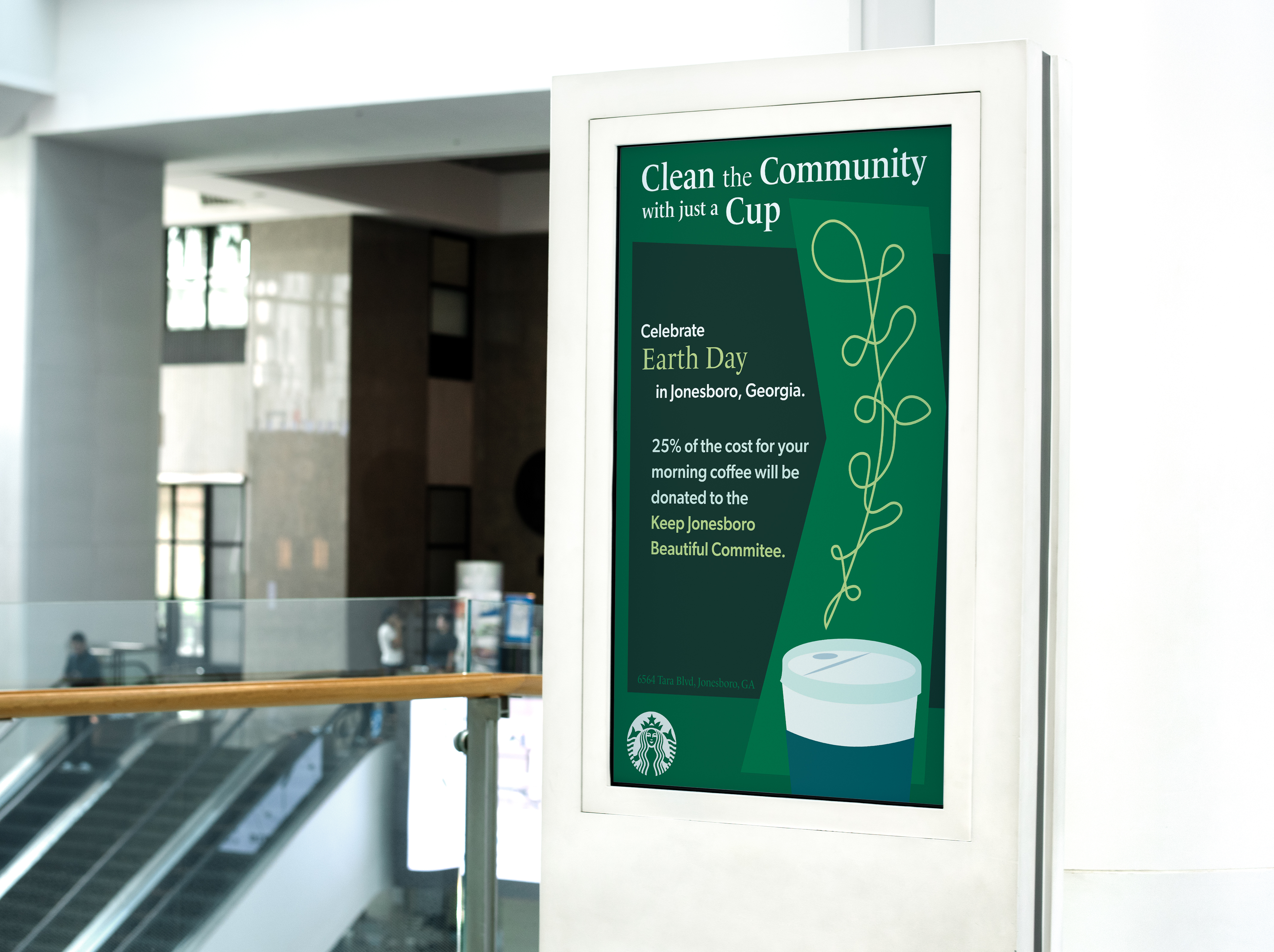
Advertising – Starbucks Event
The goal of this project was to establish a holiday event for the Jonesboro, Georgia Starbucks location (known for community influence over other locations), the selection being Earth Day, and create a poster for the event. The purpose of the poster is to bring the Jonesboro community together to both enjoy coffee and help clean the community- a donatoin apart would go towards the Keep Jonesboro Beautiful Cleaning Committee to aid in community sustainabiity and encourage others to go green while enjoying Starbucks.
WORK 08
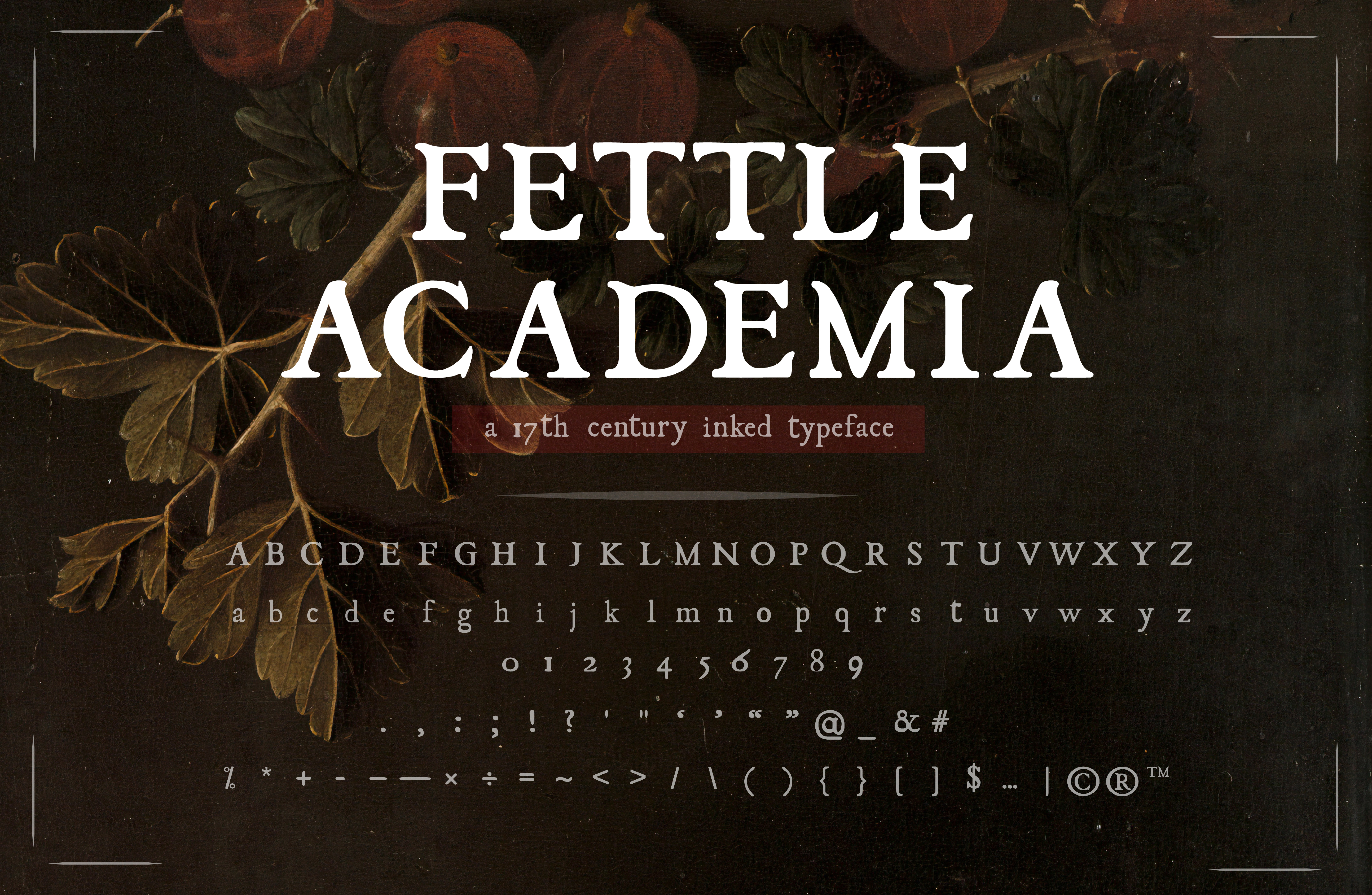
Typography – Fettle Academia
Fettle Academia is a font I recovered and revived from the original serif font JSL Ancient, a type-style font from the 1500s – 1600s that was typically used for display. The typeface was created by keeping the original structure of the JSL Ancient font family while modifying cleanliness (blotted and splotchy ink) and creating a cohesive unity amongst the typeface. The name “Fettle Academia” was chosen as “fettle” is a 16th/17th century term meaning, “to make ready; or, to clean up.”
WORK 09
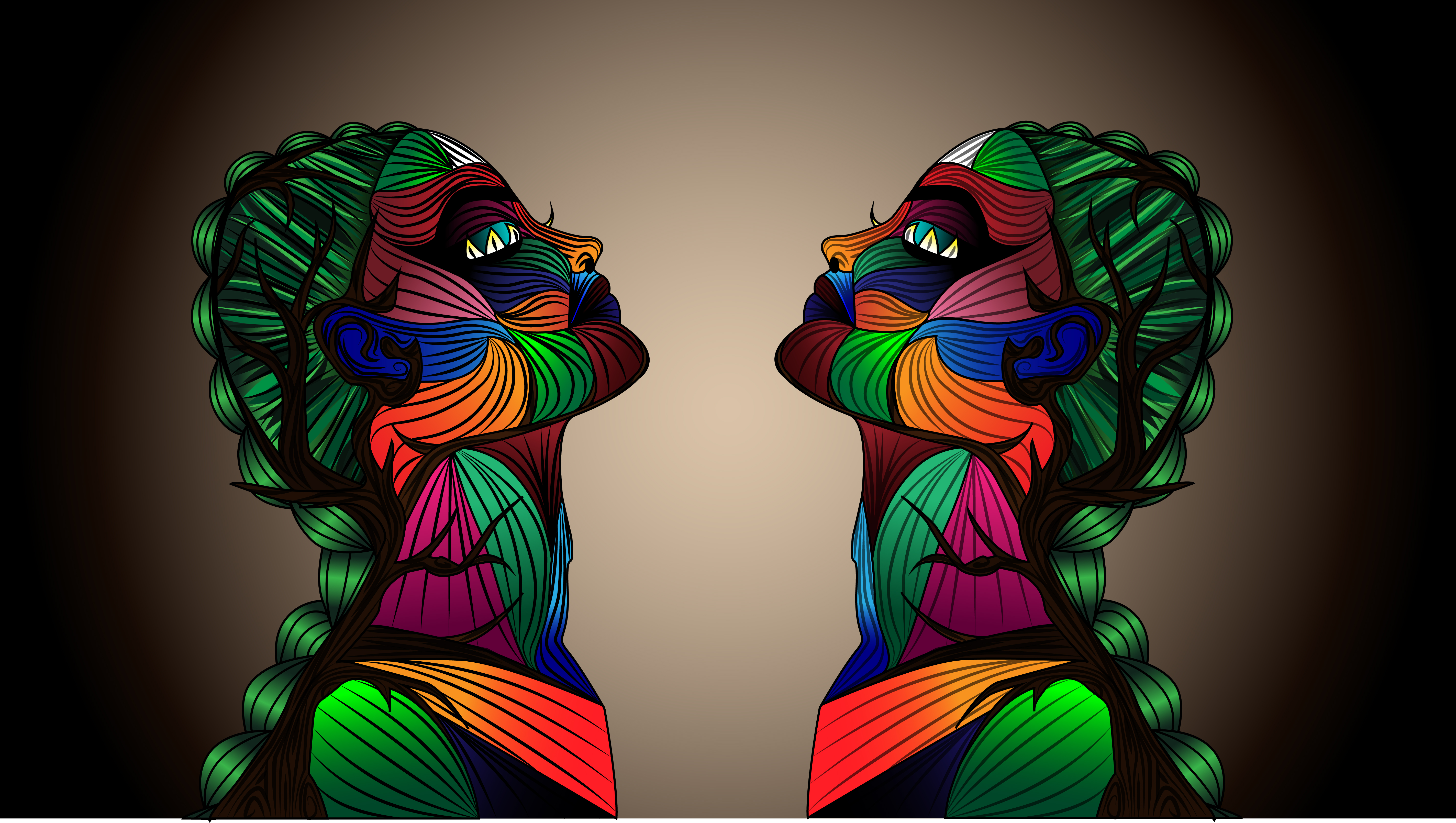
Illustration – Gestalt Project
The goal of this project was to apply two of Gestalt’s princples and create a piece according to such. For the project, I created a piece centric around mankind’s genuine and necessary relationship with nature. The two laws selected to incorperate are similarities based on color and order/symmetry. I included a vibrant yet soothing color palette of petals forming the skin, followed by a tree twisting up the neck following the spine.
Let’s get in touch.
I am currently open to new projects and commissions as of 5/10/2023.
